As a Google Certified Partner, we work very hard to provide our clients with the information they need in order to fully understand how everything from SEM/social efforts to SEO strategies is impacting their bottom lines. One of the most important aspects of a well-managed account is reporting. While metrics specific to individual campaigns should be reported in detail, a nice high-level overview of what type of traffic a website receives can be very informative if laid out in a way that is easy to understand. If this is something you’ve been struggling with, either as a business owner or one of our agency comrades, you are in luck! We have created a very powerful dashboard which can be exported as a PDF report that everyone from the summer intern to the seasoned CEO will find helpful and necessary to understand how business is going.
Before we look at each section of the report, let’s review some key terms that apply to this report but also to a well-rounded understanding of digital marketing and website activity. (We will not go over things like “age” or “gender” but if needed, you can Google those terms.)
We start with 2 metrics many (too many) people often mix up. Session or User? This is very simple; a session can be thought of as a “visit” to a website from a user or “person”. So knowing that, ask yourself if it would be possible to have 5 sessions from 10 users? Hopefully, you instantly reacted with a resounding “no way Jose”. A single user or “person” can account for multiple sessions or “visits” but the numbers cannot be the other way around.
Here are a few more definitions worth jotting down if you are unfamiliar with them:
Average session duration – Average length of a Session.
Session – A session is the period time a user is actively engaged with your website.
Affinity categories – Used to reach potential customers, to make them aware of your brand or product. These are users higher in the purchase funnel, near the beginning of the process. Think TV audience. If you run a luxury car commercial during a golf tournament, you can be fairly confident your reaching the right audience but you also know there are some that your message may not be suited for (at this time).
Source/Medium – Describes where your traffic comes from. The Source is the place users are before seeing your content, like a search engine or another website. The Medium describes how users arrived at your content. Values for Medium include “organic” for unpaid search traffic and “none” for direct traffic. So if someone saw your website listing halfway down a Google SERP (search engine results page) you source/medium would be Google/Organic.
Below are snapshots of each part of the report.

An overview of all sessions for a specified date range which can easily be adjusted.

Sessions by day of the week for the specified date range.

Users by segment for the specified date range. This shows the segments that your site visitors fall into according to Google’s categories. These visitors can be considered further down in the funnel than the affinity audiences.

Now we are looking at both users (people) and sessions (visits) based on why they came to the site.

Users (people) broken down by age. Again, you can Google “age”.

Sessions (visits) by device which is currently limited to 3 options: mobile (think smartphones), tablet (think, um, tablets?) and desktop (think card catalog envelopes in the back of library books – some are still in use).

A visual representation of where your visitors are located while visiting the site.

Don’t forget what was mentioned above about affinity categories.

Sessions (visits) by the hour of the day.

Top ten cities you should consider visiting or, top ten cities website visitors are located in while visiting a site and how long they hang out.

Again, Google “gender” at your leisure.
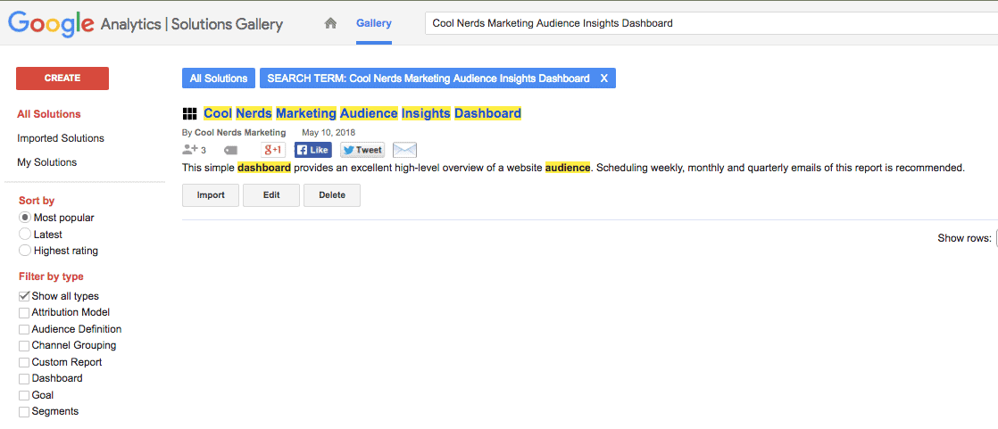
This dashboard is now available in the Google Solutions Gallery and can be applied to your Google Analytics view(s) in 2 ways. You can either use this link (https://analytics.google.com/analytics/web/template?uid=828pLo3xScKFbfWsFWT_pw) or visit https://analytics.google.com/analytics/gallery/#landing/start/ and search “Cool Nerds Marketing” then import this, and all other Cool Nerds Marketing dashboards/reports, directly into your view(s). Enjoy!