Favorite Fonts of 2019 (So Far!)
Peyton Beard, Social Media Specialist
While there are new typefaces being published every day, and hundreds of thousands made public online every year. Design is becoming seemingly oversaturated with clones and clones of the same or similar high-trend typefaces. Those that possess a flair for the dramatic, accessibility and an appreciation for the past are strong options for those looking to stand out and make a statement for their branding and design. Here are a few favorites of 2019 thus far:
Public Sans (Dan Williams, 2019)
In 2015, the U.S. Digital Service and the Technology Transformation Services (TTS) released an initial version of the U.S. Web Design System (USWDS): a library of code, fonts, tools, and best practices built to assists designers all over the government sector build consistent and reliable websites. Dan Williams, then a consultant with TTS and now a product lead on the USWDS project, wanted to explore what a custom USWDS typeface would look like as the governmental design system was using (and still use) Merriweather and Source Sans Pro as its default fonts. Williams and his team were looking for a readable, simple, and mostly traditional font.
Public Sans is a clone-like homage to Libre Franklin, an open-source update of Franklin Gothic (Morris Fuller Benton, 1912). Despite possessing determined practicality, with sharper-edged terminals replacing the rounded terminals on Libre Franklin. Public Sans is currently available in nine weights ranging from 100-900, in roman and italic. Available as a free download, this typeface would be a great option for designers in wireframes to know that the hierarchies developed will remain the same regardless of how the visual design changes throughout the design process (and pairs great with Georgia!)
Injurial (Sandrine Nugue, 2019)
Deriving from the French word “injure” which translates to “insult”, this Sandrine Nugue-crafted typeface called Injurial was designed for The Case Is In The Paper Bag, a 2014 novel by French cartoonist Boll. This glyphic, all-cap display serif font’s proportions are based on monumental Roman capitals and features lightweight characters with the slightest contrast. With a combination of precise numerals, almost round counters, and tall, slightly condensed letterforms, this stately and cultivated font gives nod to cuneiform and allows designers to maximize content/type harmony. Designed as a display font, Injurial is perfect for titling and minimal article callouts or pull quotes, pairing beautifully with wide, low contrast serif typefaces like Kelvin for a surprisingly versatile effect.
Darka (G.M. Meave, 2019)
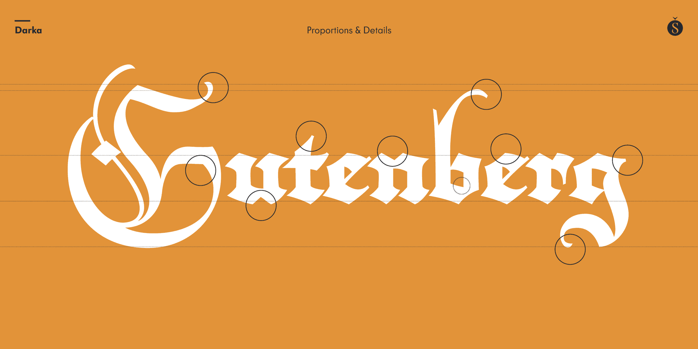
Started as a personal project for Mexican designer Gabriel Martínez Meave, striving to preserve the hand-written origins and delicate tensions based on ancient blackletter styles in a digital font. To accomplish this, Meave created a set of 415 alternate glyphs, special signs, and flourishes and his dedicated design efforts were awarded with the Type Directors’ Club of New York’s 2019 Award of Excellence. Darka is a strikingly elegant amalgam of various blackletter styles like Bâtarde’s refined lower-to-uppercase ratio, the modulated balance of Textura, and Fraktur’s flow. The lowercase “f” drops to a dagger-like point, and its sharp edges contrast beautifully with both angled and rounded terminals. Many designers are weary to use blackletter fonts, especially in the typographic landscape of today that is oversaturated by sans serifs, predictable displays, and serif texts, but Darka is a fantastic hybrid of traditional gothic lettering and contemporary style. Working best in headings, titles, deluxe packaging, or other idiosyncratic uses that welcome a Goth aesthetic. Worried what to pair it with? Meave states, “these combinations of Gothic bold type with delicate, light connected scripts were quite common in the late 18th and 19th centuries. The effect is superb.” So if you’re using Darka, why not dare to go even bolder and experiment with another playful copy text counterpart?
What are some of your favorite fonts of the year so far?


